Massage is Kee
Massage services responsive website and app
Client - Massage is Kee owner Keisha
Project Duration- 2 months
Role - UX Designer
Research Tools used- Figma
Massage_is _Kee is a massage salon which helps people relax for some time with the busy schedules.
Problem
Keisha the owner doesn’t have a website or an app to promote her business. She gets clients through instagram or sometimes through word of mouth.
She wants to expand her business and so wants a website and wants more people to know about her and book massage appointments easily online.
Goals
My goal here is to make sure more people can be reached out and can book the massages online. Also I would like to know how many people book massages online vs word of mouth or just phone calls.
METHODOLOGY
The methods I used were:
Competitive analysis- Getting an idea of what kind of massages places are around and what they offer def helps as then we can decide what needs to be on the website and also the costs of the massages in the market. There are a lot of massage places in the area so the competition is tough
Interviews- Talking to the users always is a must to get an idea of what they are looking for and what they need and will help them make their lives easy. In this case users who often go to the client could give me a feedback as well as users who often get massages can give a outlook in this area.
User Interviews
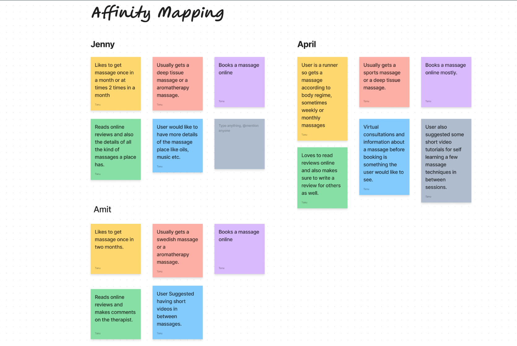
I was able to interview 3 people for my research and Affinity mapping helped in grouping all the related item together so it will be easy for solving like minded problems. I realized during the interviews that a lot of people get massages often and also most of them book them online and see reviews of other users. People tend to go to the same massage places unless the service changes.
Information Architecture
A well-structured information architecture ensured here that users can easily navigate the massage website, find the information they need, and book services without hassle. By following the outlined IA, the massage website/app can provide a seamless and satisfying user experience.
User Flows and Sitemap
To understand the process from the users perspective I created the user flows and a sitemap to help understand what the users will go through in the app.
User flows visualize user interactions, while site maps outline page hierarchy, aiding design clarity, functionality, and navigation planning. So doing this helped me get an idea of what I want to see in the application.
Feature Priority Map
Creating a feature priority map for a massage app involved categorizing features based on their importance and urgency. Here I got to realize what I should have in the app and what is not so important currently.
Low Fidelity Wireframes
After sketching out some of the designs and wasting lots of paper I came up with a few designs for what I thought I could work with. Sketching first makes ideas flow and see the vision ahead. Since a massage app I think needs to be calm, relaxing and soothing I sketched the design out but choosing color palette was going to be tough.
Mid Fidelity Wireframes
After Sketching I moved to the Mid Fidelity wireframes which of course was on Figma.It gave an idea of the layout and how the design would look on the screens. I added the image boxes, buttons etc to get a clear idea.
Style Tile
Style tiles helped me establish the visual direction of a project early on by presenting key design elements such as colors, typography, textures, and imagery. This step speeds up the UI process greatly and helped to keep consistent across pages while designing.My goal was to keep it simple, yet elegant and establish a mood in the overall design.
High Fidelity Wireframes
High fidelity wireframes are a more polished wireframes that closely resembles the final product in terms of visual design, layout, and functionality.High fidelity wireframes for me took some time to be created as choosing images was a little difficult here as my options were a little limited.High fidelity wireframes in this case played a crucial role in the design process by providing a polished representation of the user interface, design and usability I think.
Testing
User testing is crucial for validating design decisions, identifying usability issues, gaining insights into user behavior and supporting iterative design improvement. To me I think user testing helps ensure that the product meets users needs and exceeds their expectations, leading to higher user satisfaction and loyalty. At the end we are creating the product be it website, app or even just a logo for the user.
In this case the two tests conducted was for :
1.Reading through the massages and the description and choosing a Swedish massage.
2.Booking the massage with ease and navigating through the pages with ease.
After a few changes that the users requested like adding more white space and some details with the calendar my design was finally ready to be launched.
Final Designs
After receiving user feedback, I made changes to the design to improve user convenience. The feedback validated the assumptions I made during the design phase. Here is the prototype for the design in mobile version.
Takeaways
If I were to continue this project I would add a few things :
Maybe like therapist profiles and what they specialize in.
Messages and notifications for appointment reminders, cancellations etc.
Online payment options.


